予約
MENU CLOSE
MENU CLOSE
着物大事典

卒業式シーズンになると、袴を着て駅前で待ち合わせしている学生をよく見かけます。私が学生の時も袴を着て卒業式をお祝いする人が多かったのですが、最近の袴はより可愛らしくなったなと感じます。袴のコーディネートって難しいと思う方も多いと思いますので、今回は素敵な袴のコーディネートをご紹介します。
毎日の洋服の色、自分の部屋のコーディネート、料理やプレゼントなど私たちはいろいろなシーンで色を選んでいます。その中でも一番基礎となるのが「色相」です。色相は色合いの違いを意味しています。
色相の中で、似た色同士を隣にして、段階的に縁のように並べたものを「色相環」といいます。これを駆使してコーディネートの色を決めていくと素敵なコーディネートができますよ。
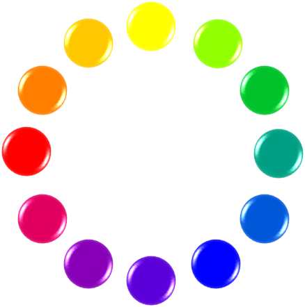
(色相環:https://tokila.jp/how-to-coordinate-colors/)
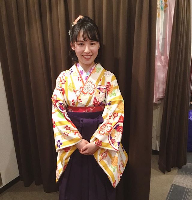
白と黄色という明るい色合いの二尺袖と、紫色の無地袴です。いわゆる「補色」のコーディネートですね。色と色を際立たせる組み合わせとして知られています。補色は「色相環」の向かい側にある色のことを指します。基本がわかっていてもなかなか難しいのが補色コーディネートなのですが、黄色の彩度を下げて暗めの黄色にしているおかげで毒々しくなく、まとまったかわいらしいコーディネートになっています。黄色のおかげで元気で活発な印象も出ている素敵なコーディネートだと思います。
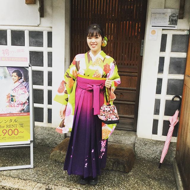
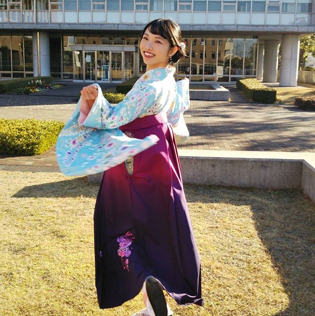
こちらも先ほどの補色コーディネートと似ているのですが、「紫」の補色にあたる黄色から±30度ずらすと「オレンジ」・「黄緑」になります。これを組み合わせると大胆な色の組み合わせですがちぐはぐな印象にならず、おしゃれに見えるんです。そして、最近流行している袴の色にグラデーションを入れた「グラデーション袴」を取り入れているので、袴ながら原宿コーデのように大胆な色遣いが目を引くかわいいコーディネートですね。
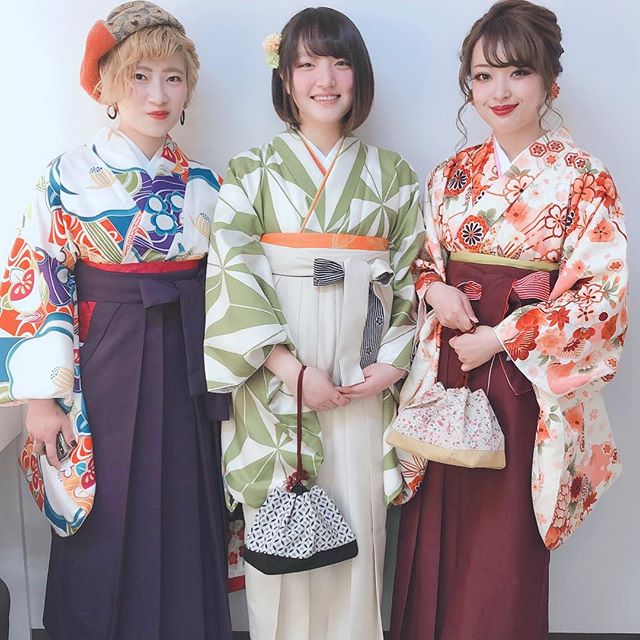
3人が3人とも違う色を選ばれているのですが、どれも同じようなコーディネート方法をとっているのですが皆様お分かりになりますか?実は色の濃度を変えると全部統一された色になるんです。左の方から順に説明すると、この方は青を中心にコーディネートしています。青の二尺袖と、より青を濃くしていくと出てくる紺色の袴を合わせているんです。真ん中の方は緑を中心にコーディネートしています。パステルグリーンの二尺袖とより彩度を下げた白に近い薄緑の袴を合わせていますね。右の方は赤を中心にコーディネートしています。赤やオレンジの花柄が印象的な二尺袖と、赤を濃くした紅色の袴を合わせています。同系色の色を彩度を上げたり下げたりして組み合わせるのはまとまりのある、初心者の方にもおすすめなコーディネート方法といえます。
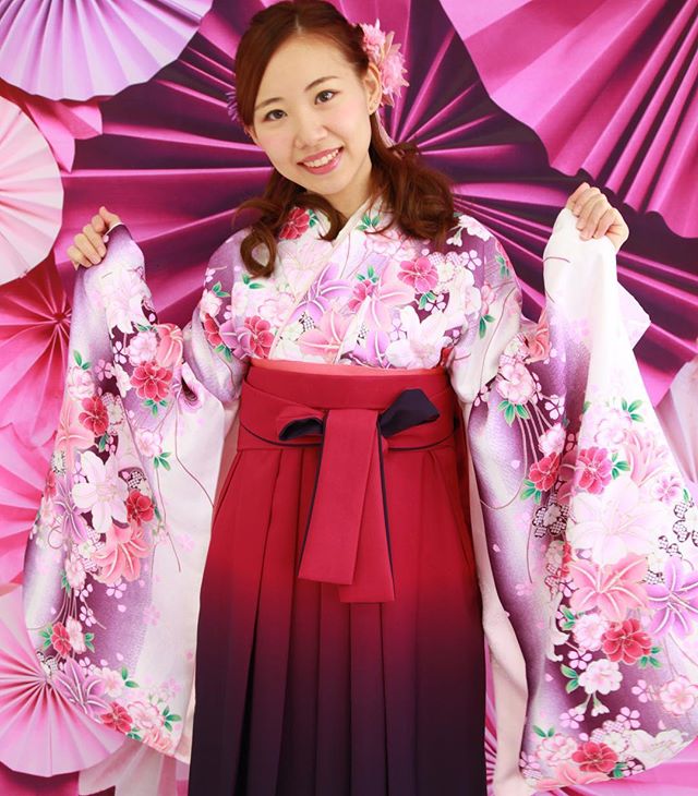
ピンクの花柄がかわいらしい二尺袖と、流行のグラデーション袴を合わせたコーディネートですね。色合いについてはピンクと深い赤を合わせたモードな組み合わせをしています。可愛らしいだけでなく、上品な印象が出ています。色相環で照らし合わせると、赤と紫の間で彩度を下げるとピンクになるので、近い色同士を彩度を変えて組み合わせたコーディネートですね。
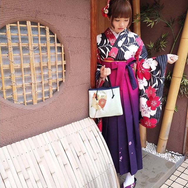
無彩色で引き締め効果のある黒は濃い色合い同士でも組み合わせがピッタリ合うオススメコーディネートなんです。黒と紫で凛とした印象を持たせています。二尺袖の柄模様の色である赤が袴のグラデーションの色とピッタリ合っていて、グラデーションをうまく活用している素敵なコーディネートですね。白黒は失敗しない組み合わせなので、どうしても迷ったときにはこの組み合わせにするというのもいいですね。
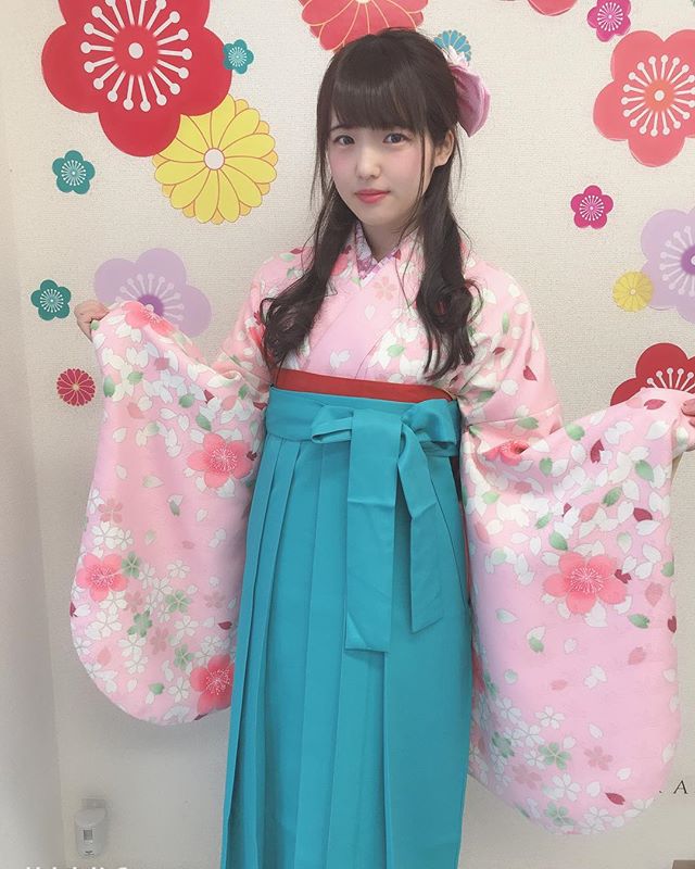
補色コーディネートの一つですが、パステルカラー同士を組み合わせるという難易度の高い組み合わせ方です。柔らかいピンクとスカイブルーが優しげでガーリーな印象を持たせてくれます。色の組み合わせ的には子供のころの組み合わせのように感じますが、配分をしっかりとすれば子供過ぎず、クールな印象も持たせてくれるコーディネートになります。
いかがでしたか?色の組み合わせを意識すれば素敵なコーディネートが簡単にできるのです。普段のファッションで悩むときも使えるのでぜひ活用してくださいね。
着物レンタルVASARAの店舗情報はこちらでご確認できます。
年中無休の着物レンタルVASARAコールセンターはこちらです。
03-6744-6725
受付時間:9:00~18:00 (年中無休)
WEB予約はこちら
カテゴリー
タグ